The term “typography” may seem unfamiliar to many, but a content that is not correctly typographically structured is well known to everyone. Simply, it is the craft of presenting a story. Typography is laid out to achieve the desired visual effect and convey message of the matter.
As an internet marketer, have you noticed that even after sending leads an email, or flyer; it’s not resulting in sales? Well, the answer could most likely be poor typography. Typography makes the first impression and enhances the character of the site while adding a tone of voice. The importance of typography has been scientifically proven.
When visitors visit your website page, the very first thing they notice is how the information is presented, how the text looks, the size of words etc. Typography is a powerful tool to convey your message.

Vital Elements for Readable Typography:
1. Scannable Text
Making text scannable implies good use of headers, hierarchy and focus points to guide the user through the content. Headers are important element in typography and header size should be accurate. Body text size, text contrast and text line height should be rightly done.
2. Typeface
It is a collection of symbols, characters, numbers and letters with same design or patterns. For example, Arial, Calibri are typefaces and not fonts.
3. Right Spacing
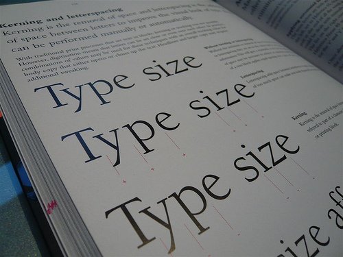
Line spacing called as leading is the distance between baseline to baseline and kerning refers to spacing between individual characters or letters. Other term that comes under the context of spacing is tracking which is also called as letter-spacing. It is applicable to blocks of text, and not individual letters.
4. Font
One good way to style typography is use of unique font within the layout along with standard fonts. You can use standard fonts for body text, while fancy fonts can be used elsewhere in the page to grab the attention of readers. Make selection of fonts that showcase your personality. For peak legibility; Arial, Verdana, Times New Roman can be used. Google Fonts is a free resource to offer you great collection of fonts for use.
5. Hierarchy
Hierarchy defines how to read through the page. It plays a vital role in how scannable the layout is. It differentiates headers from body text and shows users where to start reading and where to read through the whole content.
6. Readability
This includes a number of things such as:
Line height: This is the spacing between lines of texts. The spacing should be right enough so that readers can easily read the text.
Text size: If the text size is too small, it is difficult to read. Choose right text size to convey your message rightly to the targeted audience.
Contrast: Right color contrast is the foremost requirement to make your content readable by your visitors of WebPages.
To sum up, here are some tips to make your text more readable:
• Don’t mess with proportions: Never compress, stretch or manipulate with original proportions of typefaces.
• Group related items closely together
• Right alignment (left, right, center and justified)
• Organize the headlines, sub headline and the body with font size.
• Right line length
• Typeface should compliment your text
• Don’t capitalize every word or the first letter of every word
• Make sure words don’t look cramped or crowded
Conclusion
Typography is much more than just selecting fonts. It’s about how humans read and perceive information. It’s is about creating a visual hierarchy to grab the readers’ attention.
What typefaces are you using for your website? Share with us by commenting below!
Subscribe to our newsletter and get all updates right in your inbox.